Wednesday, 31 August 2016

Building Bridges - Exhibition Review - Ceramics


Neha Kudchadkar


‘Bridges’ was an exhibition of ceramics held at Stainless Gallery, New Delhi. This exhibition showcased the work of fifty studio potters who have trained with Deborah Smith and Ray Meeker at The Golden Bridges Pottery studio in Pondicherry.


Reyaz Badruddin
 
 
Playful porcelain and pen doodles by Neha Kudchadkar reminiscent of containers defied the weightiness of them. Reyaz Badaruddin had flattened the cup. A hollow container, usually thrown on the wheel had been painted on flat clay tiles.  Veena Chandran used a large, traditional earthen pot-form. But she flattened it out as if breaking the clay pot, and then smeared the moist clay with her hands in a gesture that sought to explore the potential of clay, beyond traditionally prescribed norms. Shayonti Salve’s thrown but altered forms were a reflection of the duality she experiences where, as she said: “my head is often tormented by the times we live in, while my heart tried to comfort it”
 

Veena Chandran


Shayonti Salve
 
 
Pottery is one of the oldest art forms in India. Known as Prajapati or Kumbhar, the potter played a significant role in ancient society. However, potters no longer command the same reverence that was once accorded to them, nor do contemporary potters continue the tradition of making pots for daily use. “Today our students are about as interested in making functional stoneware as the sons of Indian village potters are interested in continuing in their fathers’ footsteps”, say Smith and Meeker. This quantum shift from the traditional, ‘form follows function’ approach, towards the more ornamental and conceptual approach in contemporary ceramics, where ‘ideas’ supersede ‘function’, makes an interesting comment on the social and cultural values of our time.
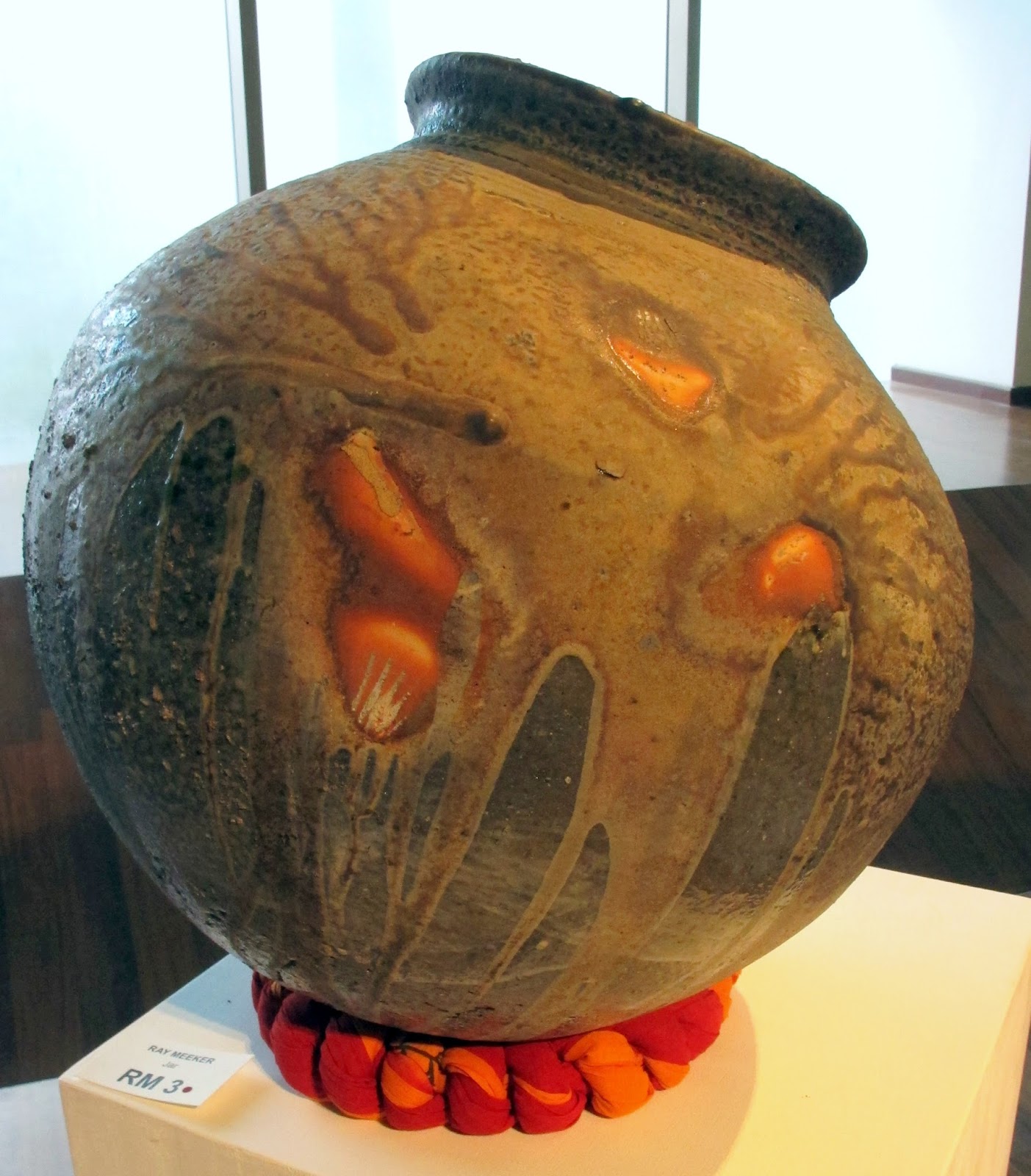
 
 
Ray Meeker
 
Golden Bridges, now a preeminent centre for ceramics, was set up in the mid 1970’s by Deborah Smith with her friend Ray Meeker, at the invitation of ‘The Mother’ spiritual head of the Aurobindo Ashram in Pondicherry. Cited as an exhibition of ceramics rooted in the Golden Bridges tradition and a tribute to the influence of Meeker and Smith one expected to find a thread that knitted together the work on display. To the contrary, the diversity of scale and style belied the fact that each of the fifty potters had been trained by the same two ceramic artists and more particularly, were trained using a specialized wood-firing technique.  Among the fifty potters participating, were Anjani Khanna, Michel Hutin, Aditi Saraogi, Manisha Bhattacharya, Adil Writer, Kristine Michael, Nehal Rachh, P. Daroz, Vineet Kacker and Sylvia Kerkar. Although primarily trained in making wood-fired studio-pottery, working in an urban context many of them have
explored gas and electric firings to evolve a differing aesthetic.
 
 
P.Daroz, From the 'Sea Bed' Series


Michel Hutin, a Frenchman who has lived and worked in Auroville for over twenty-five years, joins soft, undulating slabs of clay such that the interacting lines create rhythm, melody and counterpoint. P. Daroz has a passion for seascapes. Drawing upon memories of trips to various coasts and cliffs, his ceramic pieces from the ‘Sea Bed’ series are abstract in their presentation. For Nehal Rach an advertising graduate, who found her calling working in clay, pottery is not just something she does, but says that clay-work defines her.  Reyaz Badaruddin responds to urban spaces by evoking the disappearing fields of the agrarian landscape he grew up in. Each of these potters has moved beyond making a conventional vessel, to present abstract ideas where it is no longer about pots per se, but clay as art.
 
 
Neha Kudchadkar
 
The local potter and ceramic artist co-exist, but the local potter is not an artist in the contemporary sense of the word. He is technically skilled but doesn’t employ self-expression which is the basis of much art today. Ironically, this facet once deemed “pitiable rather than heroic” in ancient India, as cited by Ananda K. Coomaraswamy, is what is being keenly explored by contemporary ceramic artists. Pottery is essentially a skill-centric craft where the kind of clay used, kiln and techniques of firing, as well as glazes, play a significant role in the eventual product and how it looks. The firing process can be as intense as eighteen to seventy-five hours, with potters keeping vigil and maintaining logbooks. All of which is rarely mentioned in relation to exhibitions of clay work.  In positioning ceramics within the context of contemporary art, the technical process employed is seemingly superseded by the concepts explored.
 
 That the medium has evolved to transcend its functional origins, is a tribute to the creative minds that work with clay, as much as it is a yearning to bring attention and value to hands that have moulded  earth into vessel for centuries. However, the expression of self in the works on display, did not articulate an exploration authentic enough, to speak the language of contemporary art.
 
Manisha Bhattacharya


[This exhibition was held in September 2014]

Monday, 8 February 2016

In the Presence of Absence


Absesce13. Fabriano Paper 300 GSM. 2ft x 9ft. 2015

  ‘Absence’, an exhibition of paper works by Pune based artist Sachin Tekade was held at Gallery Art Motif, New Delhi, 31st October to 1st November 2015.  Four storeys above, narrow, car-filled streets, one entered a serene space - a contrast to the visually crowded and cacophonic journey there.


Absesce14. Fabriano paper 300GSM. 2ft x 9ft. 2015 


Finely cut strips of white Fabriano paper, like cloth, rose and fell. The carefully orchestrated folds, like the wave of an ocean caught in flow, or young peaks rising from a land yet flat, masked and filtered the light, in a play of shadows.
 

Absesce17.
Fabriano Paper 300GSM.
1.5ftx 4.5ft. 2015n
Absence 13 and 14 [9 ‘x 2’ each, 2015], were displayed one above the other, occupying an entire wall space. To behold these large white frames encasing delicate, quasi-sculptural lines of white paper was pure perfection. Minimal, despite the scale, the works on display were larger and more complex in execution, but visually simpler and ascetic, than his earlier expositions.  Tekade is not interested in self-expression but explores himself through a process that involves skilful dexterity. His art-making is not spontaneous. The artist first makes a maquette and then begins work on the larger piece.


Absesce18.
Fabriano Paper 300GSM.
1.5ftx 4.5ft. 2015
Tekade cuts each, even-sized and even-spaced line and then folds each line of the finely cut paper to create a desired effect. It appears as if the work is crafted from a singular sheet. But, it is the dexterity with which he carves, folds and joins additional strips of paper to complete the rectangular base, which is the challenge; enhancing the purity of his exploration in white.

Wednesday, 8 July 2015

Accidental Perfection - Mrinalini Mukherjee [Conversation/ Review - Nature Morte]


Palm Scapes, an exhibition of Bronze sculptures by veteran artist Mrinalini Mukherjee at Nature Morte, New Delhi [October 29th – November 23rd 2013] compelled me initiate a conversation with the artist.  Appendages of a Palm tree crafted so precisely, where every line of its delicate ridges appeared as though liquid bronze had been poured over a live specimen, aroused my curiosity. How was this perfection achieved?

Surrendering the knowing of the intellect in deference to the inner voice, which paves the path for perfection, is ancient wisdom. Often referred to as happenstance, it is not coincidence, but humility allowing perfection to manifest. But, rarely do artists say it just happened, in quite the way Mukherjee concedes.

The exhibition comprised a handful of bronzes from the Palm series and two works - ‘Bouquet’ I and II, from an earlier body of work. Palm Scape-V [49 x 39 x 30 inches, 2013] was a majestically crafted limb of the Palm, reclining as if on its spine. Its knee-like flexibility allowed it to bend and rest its ‘foot’ on a pedestal, appearing almost human. Placed in the centre of the basement gallery, the expansive space around it, created an aura of authority. In part, it evoked the ‘Machli Palm’ morphing into something that had little or no resemblance to the Palm species at all, but seemed akin to “fossilized trophies dug from a prehistoric swamp or the robotic armour of an alien orchid creature.” 


The ‘head’ of ‘Palm Scape-V’ opened up gladiola-like in full bloom. It’s sensuous, but rigid petal formations stretching themselves, reaching for the skies. The lower section grew into an amply fleshed, leaf-like calyx through which shoots emerged and kissed the table in a quasi reverential way. The leaf-calyx became the focus of attention not just for its placement at the centre of the limb but, because the extremely fine texture, where each fine line was delicately etched to utter perfection, commanded the eye’s focus. I asked Mukherjee how she achieved such replication of this texture. She replied saying this was not intentional: it could have been cast in plaster from an original specimen of the Palm and then in bronze, adding that when she is working, the forms being carved in wax take on the texture of the surface she is working upon and could not recollect exactly what surface created this.

Mrinalini Mukherjee is well-known for her elaborate, knotted and


plaited fibre sculptures. She has also experimented with ceramics, moving onto working with bronze. She carries forward the tradition of working with the hand, which both textiles and ceramics necessitate, and moulds the wax sculpture, before casting it in bronze, entirely with her bare fingers. If any tools are involved, they are only used to remove plaster stuck in ridges and hollow spaces of the finished piece. Here, she uses dentistry tools to extricate the residue.  Working with the hand is important to this artist who needs direct contact with her material. Where, through the conversation between the epidermal layers of her fingers and the soft skin of wax she ‘feels’ the form and its texture into being. 


The transition from fibre to bronze was not seamless but one that generated a great deal of experimentation and capacity to explore different media. Knotting for hours at a stretch, of fingers intertwining with jute to create large, anthropomorphic vegetal forms was laborious and time consuming. A chance opportunity in 1996, found Mukherjee responding well to the immediacy of handling clay, creating large pieces. But she began working with wax to make smaller, less time-consuming work - necessitated by a personal situation, which eventually led to casting in bronze through the lost wax process.  


In ‘Palm Scapes’, which marked a decade of working with bronze,  the work of hands that have felt and touched fibre in a very intimate way was evident -  as if thread had been cast in bronze. I wanted to discuss her experience from Fibre to Bronze. She was reluctant but a brief conversation ensued which was inspiring. Not because she revealed some elaborate secrets, but, for the very simplicity with which she spoke. Of how she had let chance lead her from one thing to the next, undeterred by technical limitations. Allowing this to re-define the way the medium she was experimenting with was going to be used. Mukherjee disclosed that ceramic artist Ray Meeker began his larger-than-life pieces after she had taken the scale of clay onto another dimension. 


Palm Scape-I [20.5 x 62 x 48 inches, 2013] recalls a Palm in flower, however the ‘flowers’ appear hostile and the leafy calyx is menacingly serpent-like. On the opposite end of the flowering tip was a stem extended about three feet in length, with a droopy head-like form at the far end which had a distinct similarity with the male sexual appendage. Despite the traditionally female association of a plant in flower, the form itself carried rather masculine attributes and like most of the sculptures on view appeared androgynous. The voluptuous folds and orifices of Palm Scape-VII [33 x 36 x 13 inches, 2013] could be interpreted as a feminine form, but there was harshness reflected through the use of metal and the grotesque and formidable aspect of the sculptural form. The intensified detailing evocative of a piercing gaze created an otherworldly aura, further fleshing out the masculine. The effect was ambiguous because for Mukherjee, plants have their own sexuality.

Studying these bronzed plant limbs, I was intensely aware of a
persona that was near-human.  Rigid and unmoving – stilled in time, sometimes evoking the vagina, sometimes a penile form and sometimes nothing more than a bouquet of textures, bringing forth myriad ideas  underlying which was a sense of reverence. The sculptures created a sense of awe but, Mukherjee does not speak of either her practice or her observation of palm trees encountered on her drives across the country, with the same devotion they invoke in the viewer. On the contrary, she is very matter-of-fact with words. The interplay of the sensual or erotic and meditative that manifests in the sculptures through attention to detail and intensity of gaze – making a connection that evokes divinity or puja as it were, is not part of her conscious practice either.

Mukherjee records her observations and translates them into her sculptures by neither drawings nor photographs. But driving around Kerala, Goa and other places, she just looked. Different palm forms found their way into each sculpture and it’s hard to say where one began and the other ended or when it took on a character that went beyond that of the palm, or that of any plant-form itself. 


Mukherjee doesn’t define the forms she doesn’t deify them either, but the works exhibited evoked an unseen presence. Some of the creative process is controlled but mostly not. Because she likes to look back at her work with a sense of awe, which is probably why her bronze sculptures bring forth a similar response in the viewer too.


Friday, 29 November 2013

Small Wonder -Rahul Kumar [ Review]


Astronomically Small was an apt title for Rahul Kumar’s exhibition of miniature pot sculptures at Art Heritage Gallery, New Delhi, from the 2nd of March to the 3rd of April. These minuscule works made us wonder if a pot could be more than just a pot..

Near the entrance of the gallery, three very small cadmium-red glazed pots placed in an unglazed terracotta niche appeared like votive offerings. Many such miniature works filled the gallery – placed on walls or on raised, uneven ceramic pedestals. Collectively, they evoked the poetry of Omar Khayyam.

One of the works featured an indigo vase, just over an inch high, on the edge of a scroll-like strip of white textured porcelain marked with occasional black swirls. In a similar vein, a small white teapot, merely two inches high, stood on the edge of a flat patch of terracotta with a wave-like form at its far end.

To make his delicate pots, Kumar’s doesn’t throw clay on a wheel but moulds each sculpture by hand. The scale of the works commands close examination and inspires contemplation. 

In the show, Kumar also displayed sets of larger tiles mounted on grid frames. These works seemed to have no relationship with the ‘Astronomically Small’ theme. This slight confusion detracted from the power and beauty of the exquisitely small pots. 


Thursday, 31 October 2013

Canvas of Thread - Monika Correa [Review]


I was first introduced to the tapestries by Monika Correa through the pages of ‘The India Magazine’ in the early 1980’s. Then, a student of woven textiles, I was awed by her audacity and ingenuity in removing the reed of the warped threads to weave those fluid yet structured, unforgettable images of the Banyan Tree. This technique, of removing the reed while weaving the fabric, has become Correa’s signature style. In the present body of work, ‘Meandering Warp’, exhibited at Gallery Chemould Prescott Road in Mumbai, the visual qualities of the woven pieces have moved away from representing any sense of the figurative towards a more abstract and philosophical exploration. The large woven pieces present a tactile sensuality that is evocative of a deep, intense questioning of something that seems to have no answer, because, a similar question persists throughout the works. Correa’s woven explorations meander but do not necessarily deviate from the essence of her intellectual preoccupation. The thread canvas is ascetic, yet sensual, evocative of the universal, yet intensely personal

‘Jamshedpur’ [40 x 53 inch], is woven with red-dyed cotton threads in the weft and an unbleached off-white cotton warp. This contrast both highlights the redness of the maroon and softens its bloody overtones. The warp begins, at the bottom, with a division into three, almost equal parts, where in the central portion the reed has been removed lending fluidity to the threads, while the outer ends of the warp threads, are fitted within the confines of a reed for a more structured weave. The basic construction is an open twill weave where the weft colour dominates. The artist has envisioned the work such that even though the magic of its construction lies in the way the warp threads are manipulated, the coloured weft provides the contrast in hue and texture to highlight the dancing movement of the warp threads. A quasi-Rothko-like sectional is drawn as the eye moves slowly from bottom to top, following the weft, but along the lines of the warp. Akin to a vertical river flowing upstream, the wavy threads culminate in a square of vertical waves - effortlessly contained. For, as the weaving progresses, they respond meekly to the discipline of the reed. As if a restless mind having expressed itself has been appeased. 

Each tapestry seems to be a continuum of such inner explorations. The trajectory is subtle. ‘Foggy  Day’ [40 x 70 inches] begins with the dark colours that underlie the dinginess of a day where the light is blocked by a cloudy sky. Gradually, as the weaver shuttles the weft in and out, light seems to penetrate the realms of a mind fogged out. A Black weft leads to a deep blue and then it gets lighter still until the unbleached cotton warp and weft seem to meet in a confluence of enlightened minds. There is an apparent resolution to this foggy day. However, Correa’s more successful works are those where the resolution is not quite so obvious and the warp distortions create deceptive illusions.

The optical illusion created in ‘The Sound of Silence’ [28 x 62 inches] is skilfully constructed. Woven with black cotton warp threads and a contrasting, unbleached cotton weft, the chatter of the unspoken voices seem to get louder and louder. This is denoted by a singular, precisely woven, steep chevron rising upwards, dissipating into a medley of confused lines. The chevron is still there, but the clarity of its form has dissipated. And yet only so much, for it cannot escape the essential pattern determined by way the warp has been threaded, a construction that is precisely articulated, with the help of the reed, at the commencement of the tapestry.  This piece ends with a black warp and weft woven together which obscures the detail of the fabric construction. And darkness descends, as it must when we give into the insecure chattering of the mind. The monochromatic colour-scheme and deceptively simple woven construct draw the viewer into their own mindscapes, looking for something familiar, finding it and then losing it, but without getting lost. There is clarity despite the conundrum.

The tapestries by Correa are highly evocative of the machinations of a contemporary urban mind. There is discipline, but restlessness too. There is structure, but yearning for freedom and fluidity - to just be. Sometimes there is resolve and often resolution too, but many times darkness descends before lightness dawns. The weaving is skilful. The ideas are subtle and not equivocal. Correa’s threads are open to interpretation. Each viewer must find themselves in these thread-ruminations as we do in the fluid, reflective surface of a deep pond. 
 

 I found the monochromatic pieces most appealing and the black and white ones most appropriate for the ascetic meanderings of a subtle and refined mind. The exhibition could have been more concisely edited. ‘Tree-One’, ‘Homage to Kepes’, ‘Purple Rose of Cairo’ and ‘Bethlehem’ brought much coarser elements into play. These detracted from the subtlety of the major body of work and I felt that had such works not been included, the song of Correa’s threads would have touched an unforgettable chord.